Wednesday, 2 November 2016
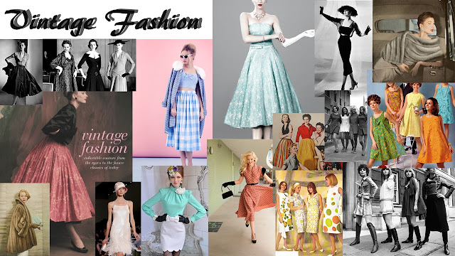
Vintage Fashion Moodboard
Here I have collected fashion ideas for my model to wear in my magazine, this will help link it to the Vintage Music theme.
Monday, 31 October 2016
Star Image in magazines
 The star image in a magazine has to be glamorous as they're a construction, not a real person - Richard Dyer says. I agree. The star image has to look the part for the magazine, they create the image of the star to fit the genre.
 Here Johnny Cash sits for a medium close up, looking directly at the camera for Vintage Rocks magazine cover, he shows a powerful, yet emotional facial expression. The direct eye contact of the star and the reader draws the reader in, they want to know about this strong, powerful and deep looking man. Johnny Cash is written in a large serif font, attracting the reader, however underneath it says 'Outlaw poet and voice of the dispossessed', its like the magazine is saying the lost voice, relating to the death of the famous singer.

This magazine cover shows a woman, in a medium close up, that was seen as a 'Rockabilly Queen'. So here the magazine presents her as a beauty, hair in curls that look effortless, bold eyebrows and bold lips and a delicately detailed clothing to show her importance in the music world. She's smiling, showing she is happy and looking directly to the camera, looking right at her audience with bright eyes. This plays a huge part of the star image as they need to look appealing so that people will want to read about her. The star image shows a beauty, with a talented voice, she looks very glamorous and looks as if she is just about to go on stage. It shows that she is passionate for her singing and will attract fans and others to read about her.
Sunday, 30 October 2016
Thursday, 27 October 2016
Locations used in existing magazines

 I found that in many Vintage Rock magazines, they contents locations for their shoots are usually on a set and performed.
 They have a block colour background and the some of the artists on the front covers are not with us anymore, showing that the magazine edits pictures of the artists onto the magazine.

 The photos are not taken by them. The photos are usually black and white, to show the age of the performer, so when they use a block, bright colour for the backgrounds it represents old with new.
The magazines usually show the artists in motion and on each magazine there are various angles, wide and close up shots. The covers usually use a classic coloured background, the colours are strong and mature.
This has influenced my planning and creativity because it shows how the vintage magazines are set out to show the old and the new to their audience. I could possibly do something like this so that I can show the old and the new in my magazine too.
Tuesday, 25 October 2016
Friday, 21 October 2016
Masthead: Font survey
Masthead: Possible Fonts
Subscribe to:
Posts (Atom)


